I proposed
Two screens over one contract, each designed for the person using it.
Freelance visual design for a seed-stage startup, 2023
Contract screens for an escrow tool between creators and businesses. I proposed a separate screen for each side; with no time to build two, we agreed on one screen that works for both.
I took the project because Qube wanted to connect creators and companies fairly. The team needed someone to turn their ideas into Figma designs rather than a researcher, so I designed the landing page and then the contract screens.
The business (client)
“I pay up front, and the work comes back poor, late, or not at all.”
The creator (freelancer)
“I deliver the work, and the payment is delayed, short, or never comes.”
Qube’s answer: the client pre-pays into an escrow smart contract. Both people can see the money, and it is released only when the client approves the submitted work. If they disagree, Kleros, a decentralised court, settles it. Sharing a link is enough to start, and neither side pays gas fees.
The contract passes between the two people like a baton: each filled step is whose turn it is, each dashed step is waiting. The pink band is how long the money sits in escrow.
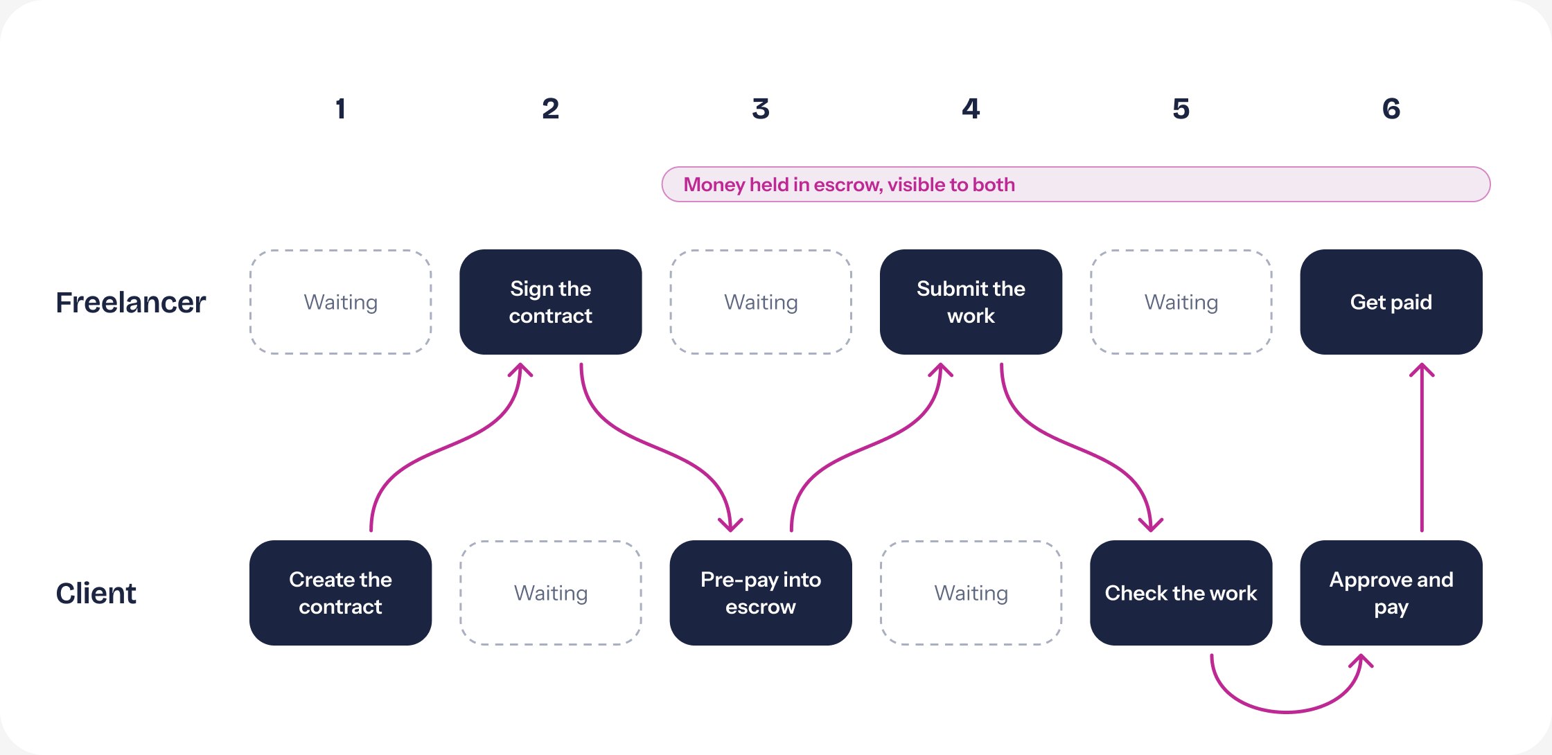
Redrawn from the “How to” section I designed for the home page.
The two people in a contract are not alike. Creators are designers and live in dark tools. Businesses want something calm that looks reliable and is quick to read. So I proposed two screens over the same contract, each in the colours of the person using it.
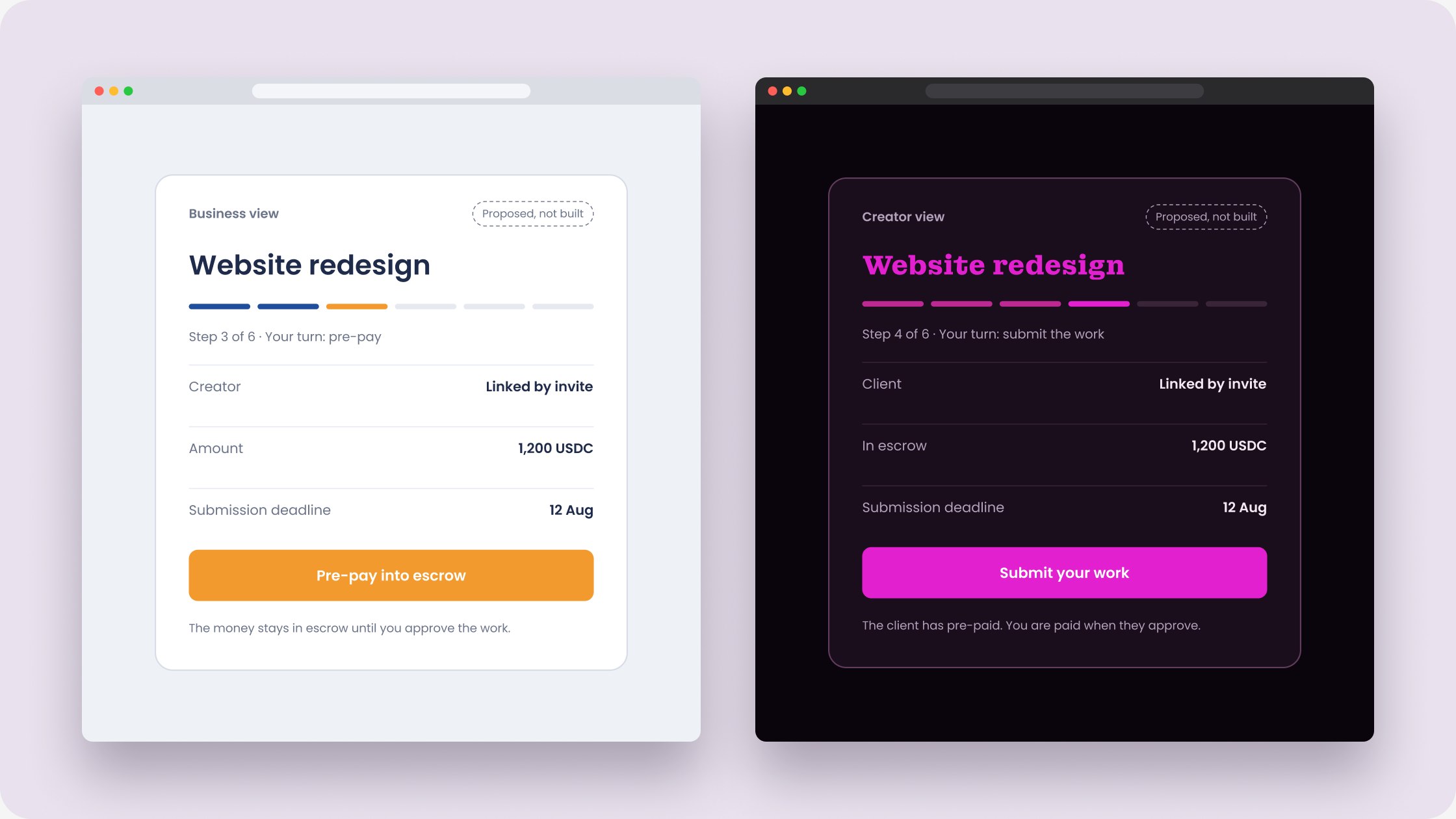
For businesses: white, blue and saffron
Blue for the record of what is done, saffron only for the one thing to do now. Plain words, no glow.
For creators: the dark Qube palette
The palette the founders asked for, which also suits designers who spend their day in dark tools.
Redrawn for this case study from my proposal. The original sketches can replace these when found.
Two screens over one contract, each designed for the person using it.
One screen. As a startup they had to try the product out as fast as possible, and two screens meant twice the build.
One shared card for both people. Whoever needs to act sees bright buttons, the other sees what they are waiting for, and a line says whose turn it is.
What one screen gives up: the business sees the creators’ dark, glowing style, which is the opposite of what I thought would make them feel safe.
One card holds the whole contract. Each step is a button that lights up when it is that person’s turn and stays marked once it is done, so both people can read the history at a glance.
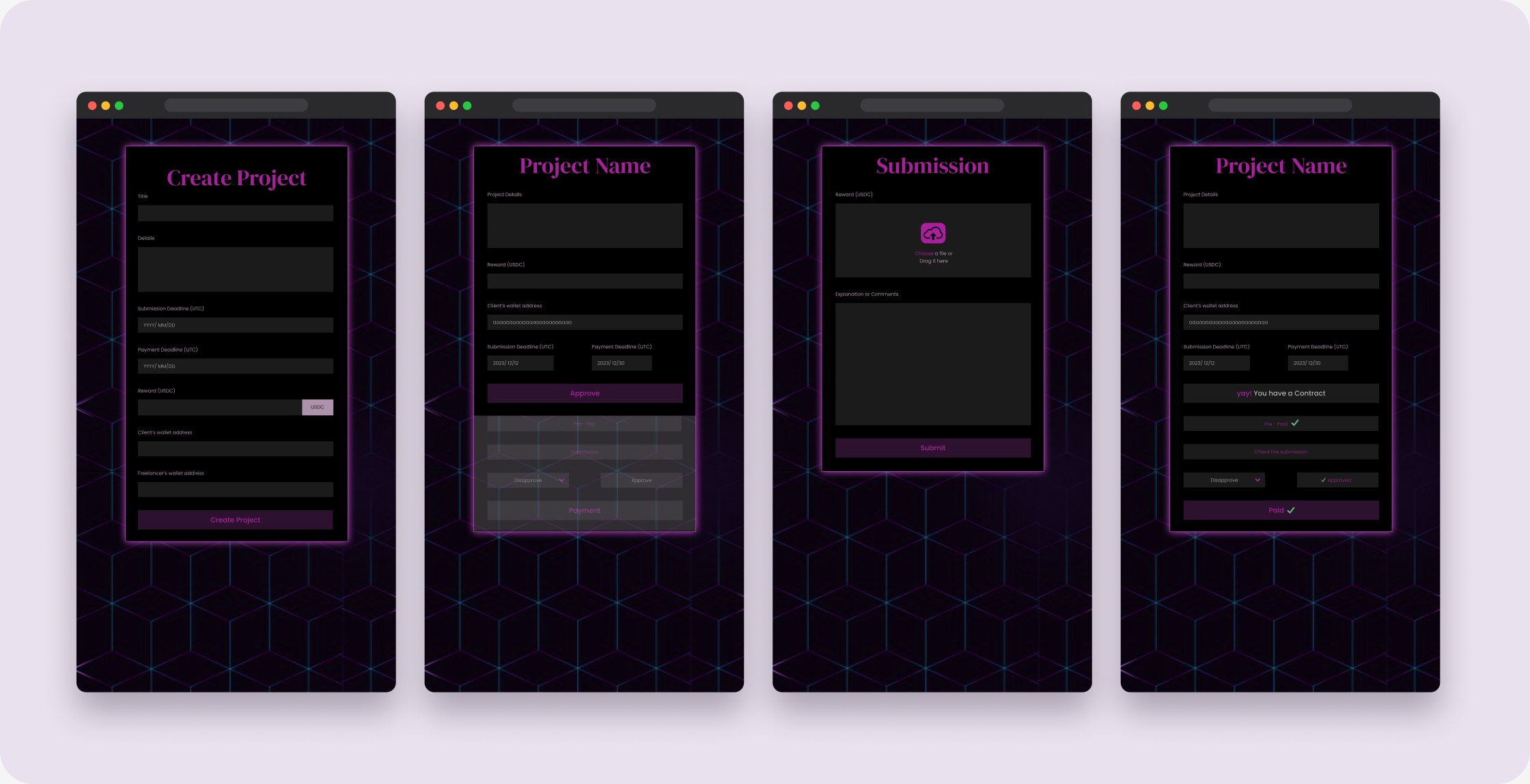
Step 1
Client creates the project and sets the reward and deadlines.
Step 2
Freelancer reads the terms and approves.
Step 4
Freelancer uploads the work with a note.
Step 6
Client approves; payment is marked as paid on both sides.
With both people on the same card, the screen has to say who it is talking to. I wrote “Time to take action for You”, with the gradient on “You”: whoever opens the screen knows it means them. The team wanted the role written out instead. I disagreed, because the person reading already knows who they are and does not need a label, but it was their call, so the final design names the role.

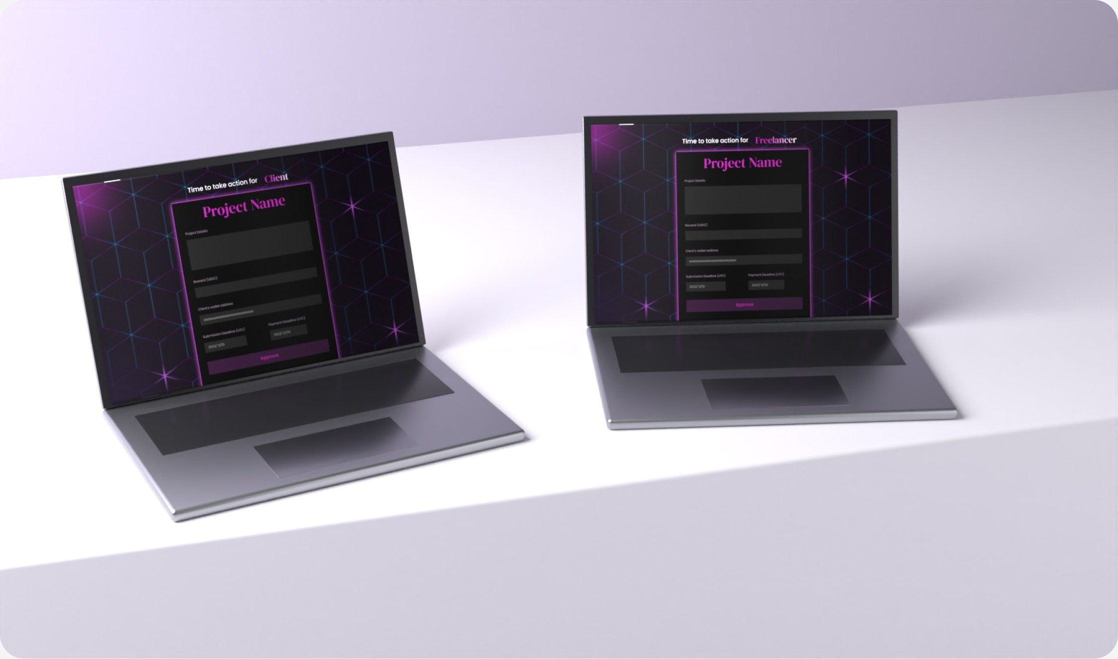
The final design, client and freelancer views.
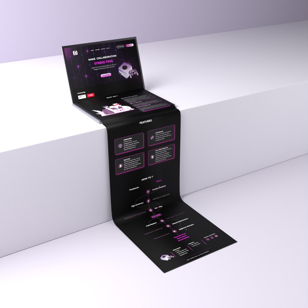
The founders asked for a dark screen in purple and magenta, and the GameCube on the landing page. I built it around a grid of cube outlines, cards with a soft magenta glow, and one bright colour kept for actions.

The first thing they asked me for. One long page: the promise, why it is needed, four features, and the six steps.
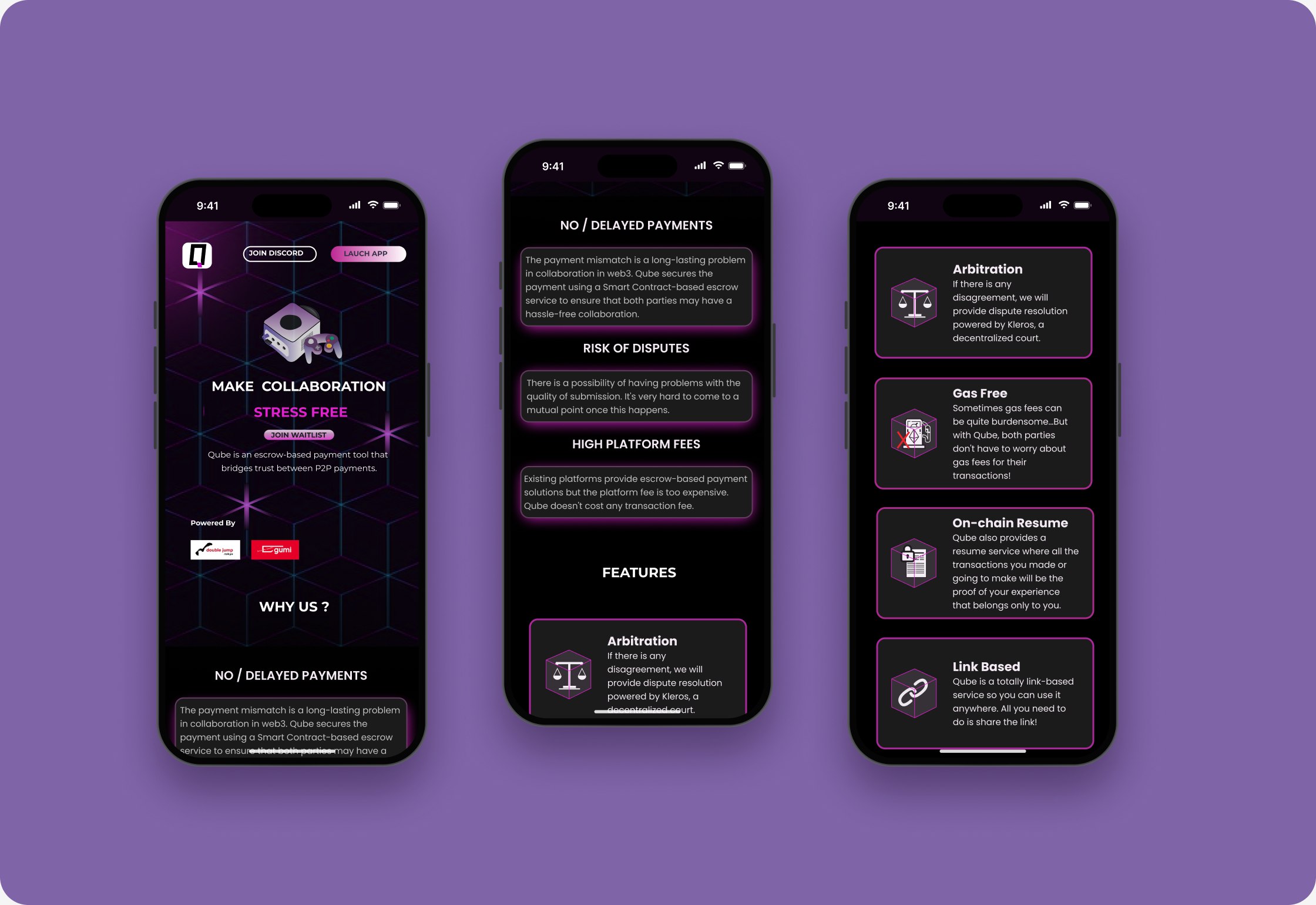
Mobile: the same page in one column.
My screens took longer to build than the team had, so they shipped an easier version for creators. Businesses were handled through a form instead. Later, Qube could not win the market against large agencies, and the company pivoted to marketing.
I was hired to put ideas into Figma, not to research. I still argued for the people on each side of the contract, and when time won, I made one screen carry both. Next time I would ask for one session with real creators and businesses before drawing the first screen.
Two sides of a contract may need two screens. When there is time for only one, its job is to make it obvious whose turn it is.