A Sony × University of Tokyo workshop project

Aida no Kimochi

A soft heart for the child and an app for the parent. When a tired parent’s voice turns sharp, the heart speaks a message that parent wrote earlier, in calmer words.

I led the design in a four-person team during the Slow Tech workshop run by Sony and the University of Tokyo. We exhibited the concept at the University of Tokyo.

A pink fluffy heart surrounded by smaller red, yellow, green and blue fluffy hearts
Role
Design leadConcept, device and app system, UI
Scope of work
Child’s device concept and parent mobile app
Team
Four peopleA researcher, a software engineer, a hardware engineer and me
Timeline
4 weeksSlow Tech workshop

The problem

A parent comes home tired and speaks sharply. The child hears the tone and has no way to know the reason.

Children of 3 to 7 often feel anxious or scared when a parent sounds annoyed, and they assume it is about them. The parent feels guilty later. Neither side gets to explain.

Our solution

Pair a soft toy with an app, and let the toy say only what the parent has already written.

The parent writes messages in advance for the moments they know are hard. When their tone changes, the toy picks one of those messages and speaks it to the child. It cannot say anything else.

Results

Working fathers told us they wished they had this, so they could feel closer to their children.

We exhibited Aida no Kimochi at the University of Tokyo. Most of the feedback came from working parents, and the strongest response came from fathers. They recognised the evening we were describing and wanted a way to stay connected through it.

This was a concept project. There is no hardware prototype and it has not been tested with children, so the exhibition feedback is the evidence we have so far.

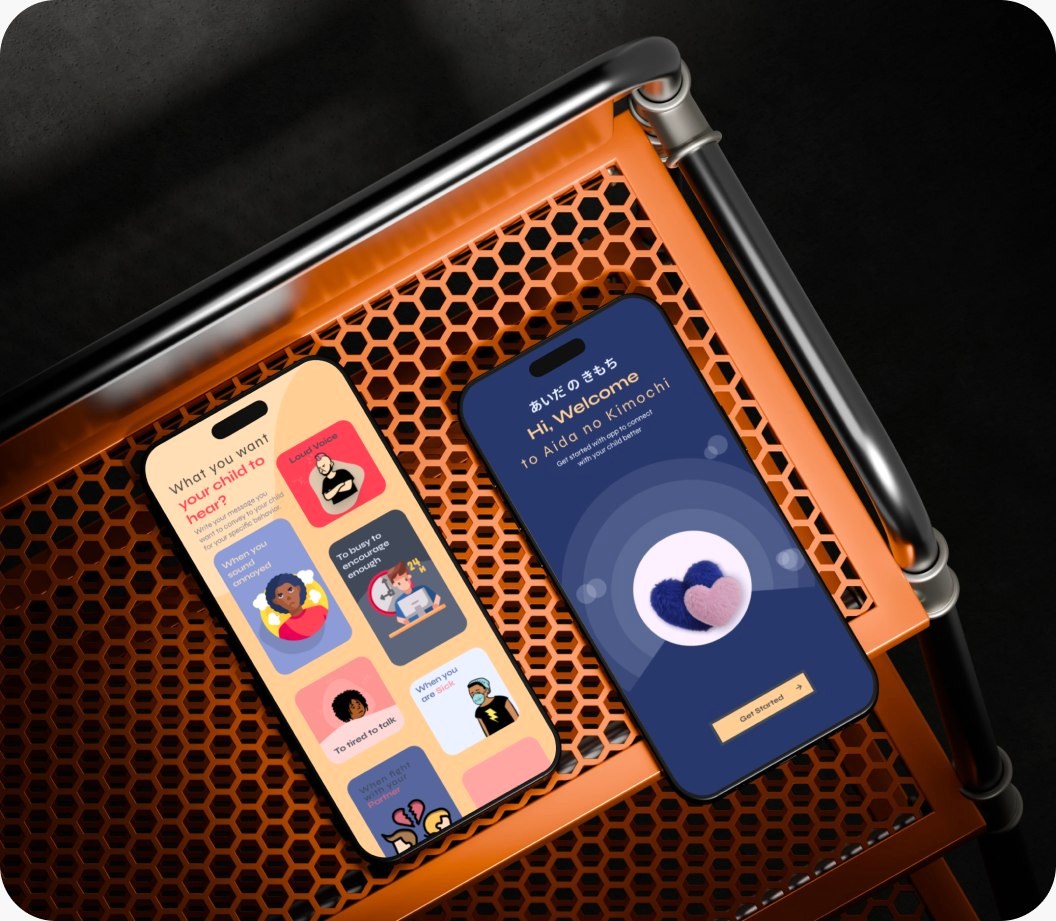
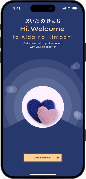
Two phone screens of the parent app: the welcome screen and the message hub, on a navy background

About the project

Slow Tech was a workshop held jointly by Sony and the University of Tokyo. The theme asked for technology that responds to things too small or too subtle to notice at the pace of daily life. Each team had four weeks.

Our team was a researcher, a software engineer, a hardware engineer who is also a mother of three, and me. The name we chose means “the feeling in between”. Its tagline is はやくわかる、よりも ゆっくり、ちかづく: rather than understanding quickly, slowly get closer.

I set the design direction, proposed the system of device and app, decided the shape of the device, and designed the app screens. We did not build working hardware. The concept was developed and checked through UI screens and interaction flows.

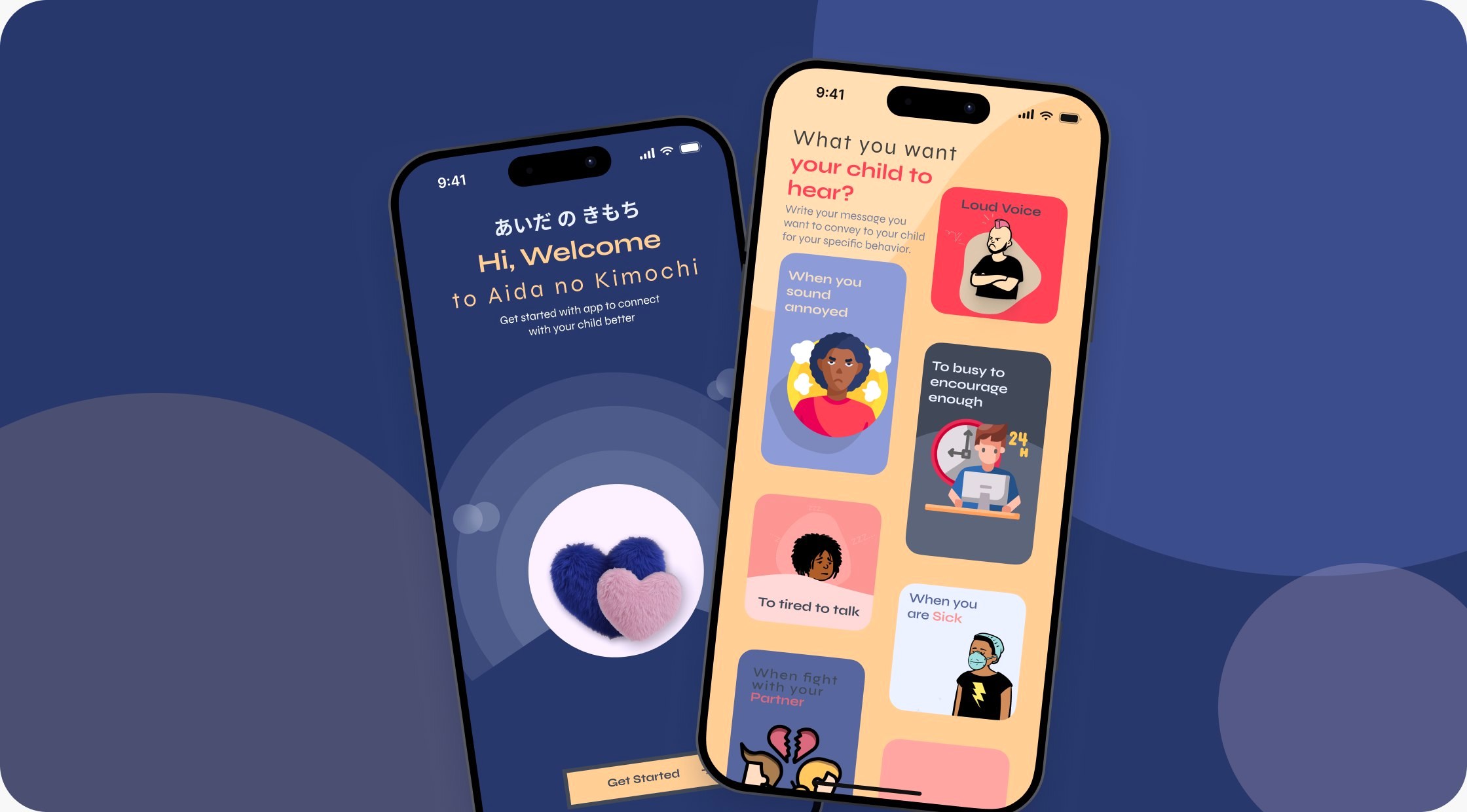
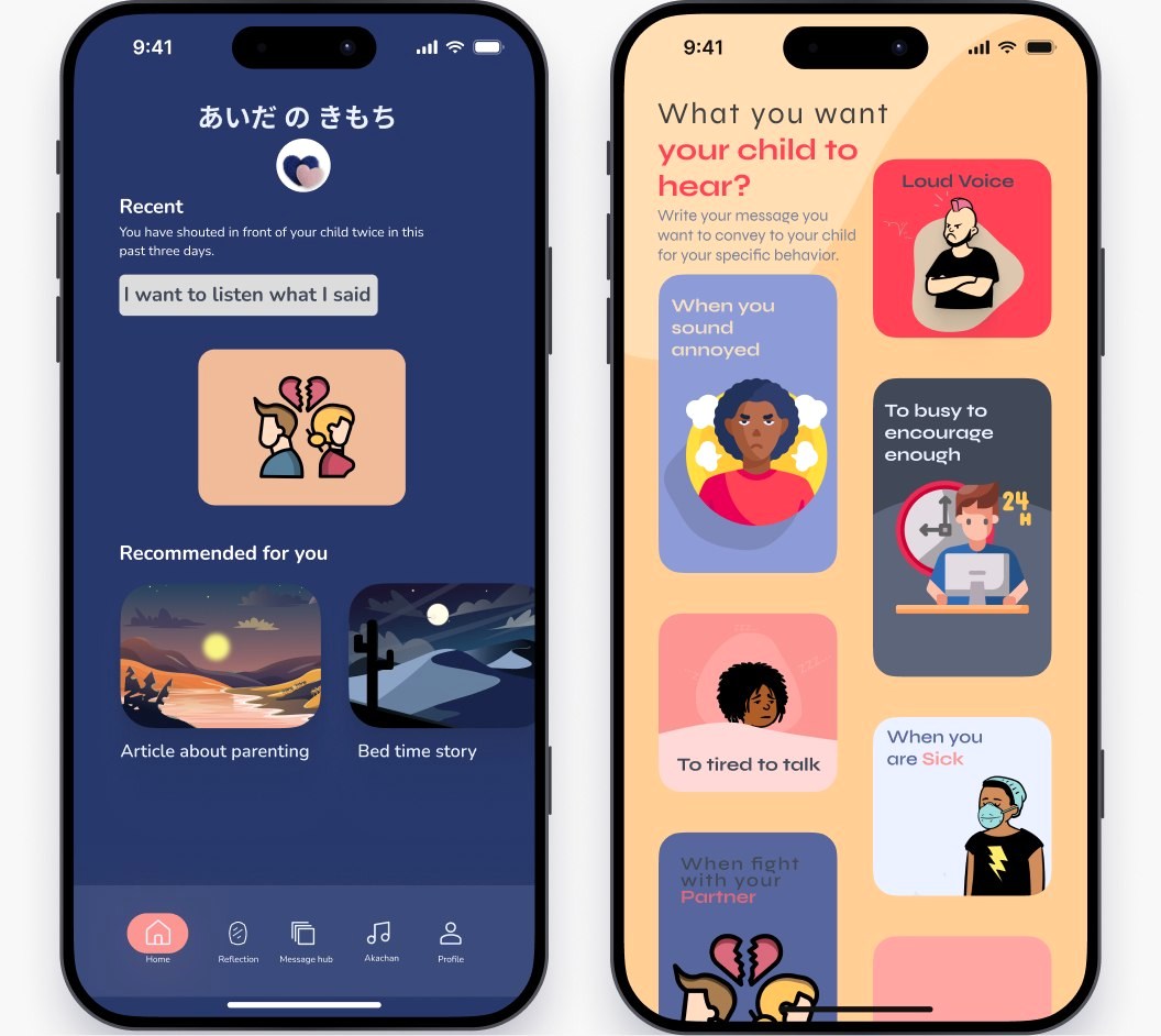
The parent app: the welcome screen and the message hub
The parent app: welcome screen and message hub.

How we got there: three rounds of brainstorming

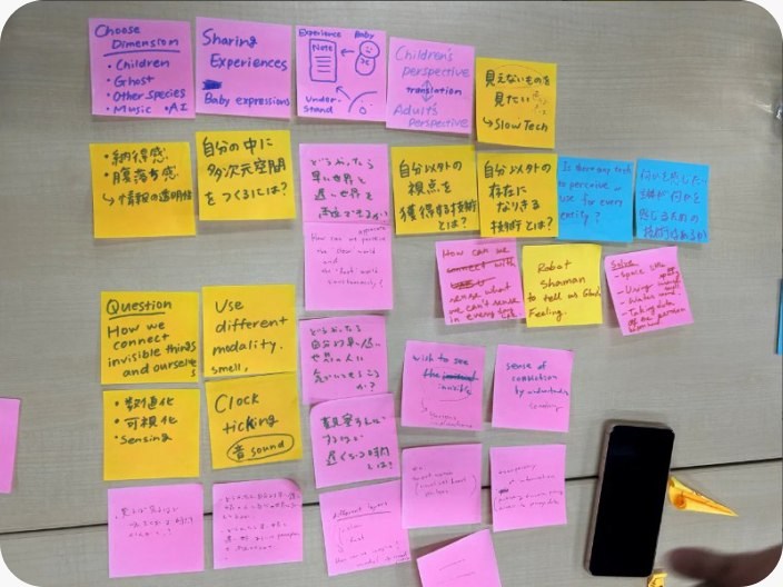
Pink sticky notes from the first brainstorming round

Round 1

What does Slow Tech mean to us?

Pink notes. We wrote freely: seeing what is invisible, fast and slow worlds side by side, a child’s view against an adult’s view, translation between them.

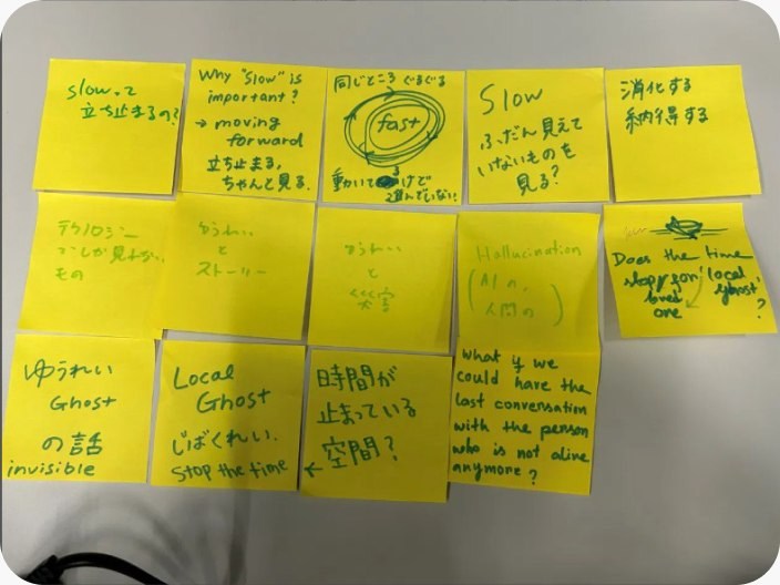
Yellow sticky notes from the second brainstorming round

Round 2

How could we use it, and for what?

Yellow notes, most of them mine. I pushed on directions: local ghosts, a place where time has stopped, one last conversation with someone who is gone.

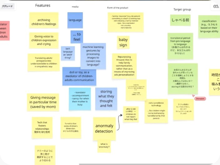
A Miro board where the idea took shape

Round 3

The project takes shape

A Miro board. The idea became “a translator between children and adults”, and we sorted features, the form of the product and the target group.

Where the idea turned, and what I brought

From decoding cries to communication

Our first direction was a device that interprets a baby’s crying. I found that someone had already made an app for that, and the research around it was well covered. I felt our project could be about communication instead of decoding.

A working mother of three

Our hardware engineer is a working mother of three. She wanted to connect with her children more and to understand them better. Because she is not with them all day, she felt there were things she could not see. She also did not want them to feel alone at home. That is where the idea of a toy came from.

The nanny who is no longer there

We talked about nannies. A nanny used to do this work between parent and child, and in many countries still does. In Japan’s economy that is out of reach for most families, and some parents do not feel safe or comfortable leaving someone else at home with their children. The toy takes on a small part of that role.

The other direction, from my own childhood

I grew up with working parents. I felt that children also need an explanation of why their parents behave a certain way. That turned the project from “understand the child” into understanding in both directions.

The age group

I proposed children of roughly 3 to 7, from kindergarten to the start of elementary school. They are becoming independent and spend much more time away from their parents.

The questions we were asking

How do we connect invisible things and ourselves?

From the first round of notes

Why is slow important?

From my notes in the second round

Isn’t language an adult thing?

From the Miro board

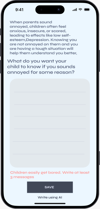
What do you want your child to know when you sound annoyed?

The question the app now asks every parent

The insights

A parent cannot see everything

She is away for much of the day and felt there were things about her children she was missing.

Children should not feel alone at home

She wanted her children to have company when she is not there. This is why the child’s side became a toy.

Children need the reason

I grew up with working parents. A child understands the words, but cannot see why a parent sounds different today.

Design decisions

The goal was to help without taking over. We did not want a machine that speaks for the parent. The system is deliberately limited so that parent and child still do the work of understanding each other.

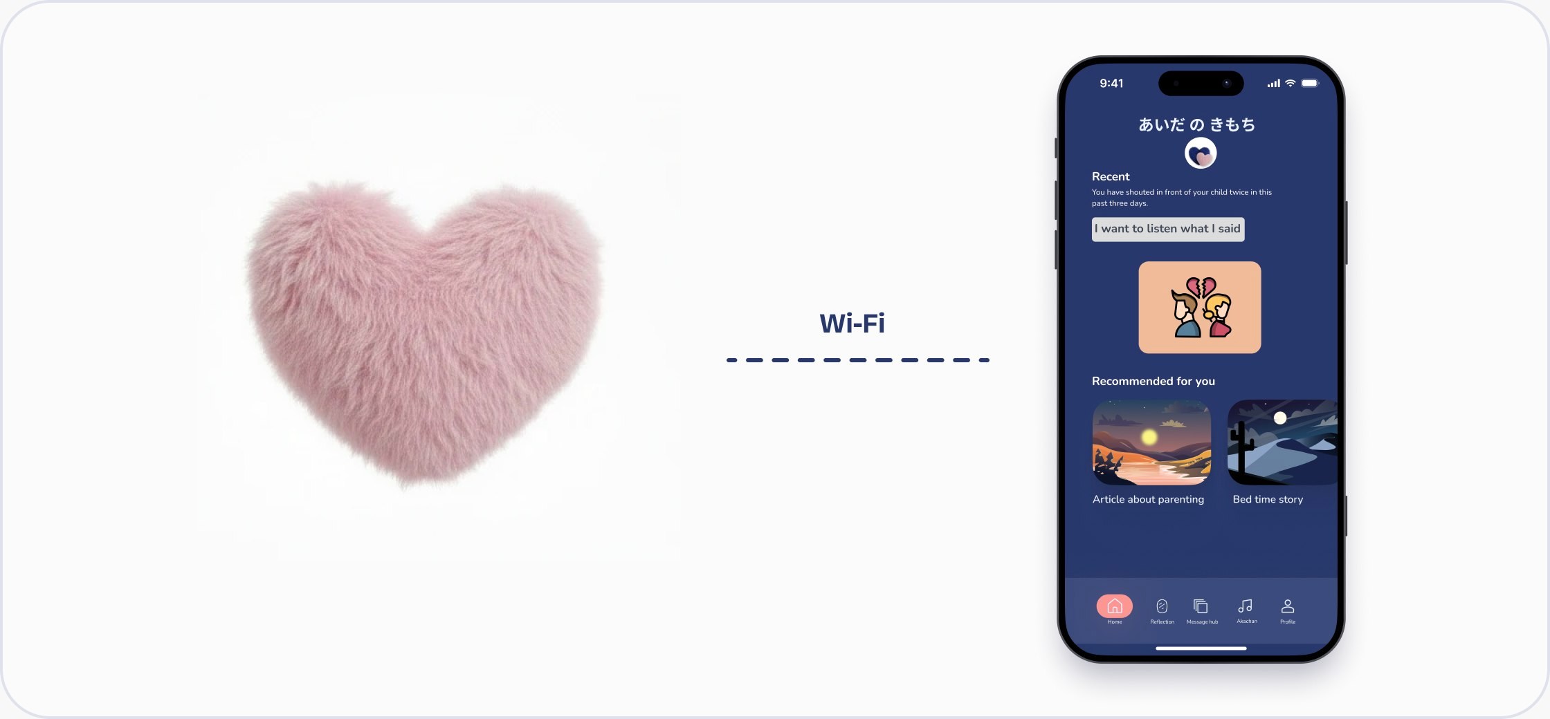
The heart toy next to the parent app

A toy and an app, working together

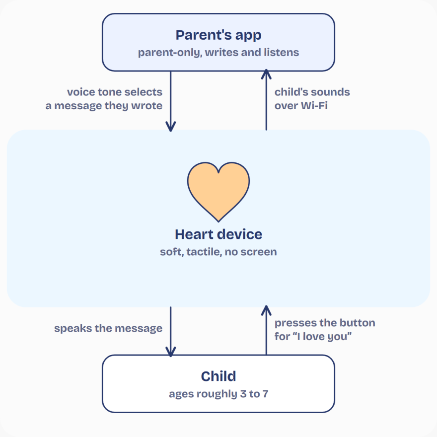
This pairing was my suggestion. The child gets a toy and never a screen. The parent gets an app that only they use. The toy also listens: it records the child’s voice and sends it to the app over Wi-Fi, so the parent can hear and answer.

Diagram: the heart device, the parent’s app and the child. The parent’s voice tone selects a message they wrote; the child’s sounds go to the app over Wi-Fi; the device speaks the message; the child presses the button for “I love you”.
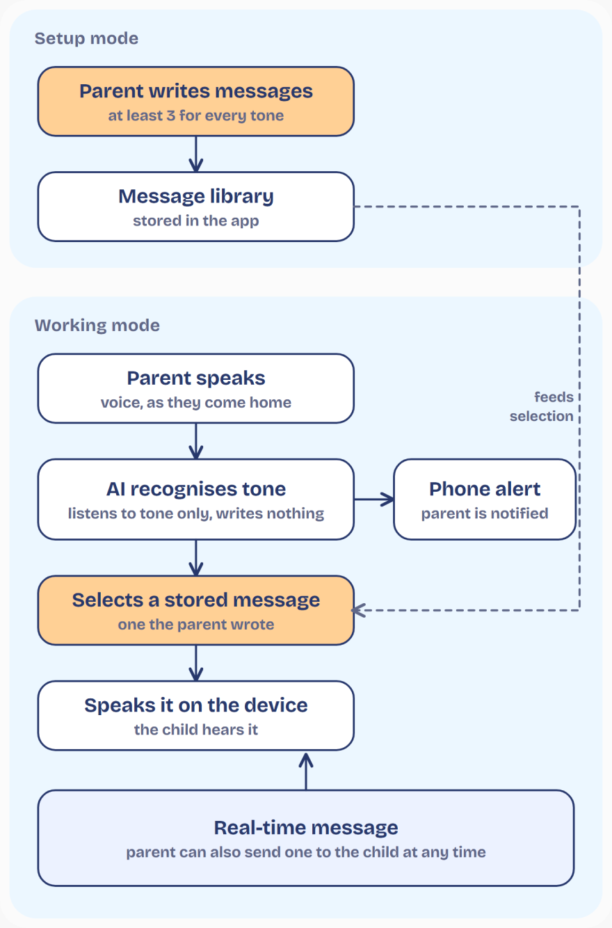
Diagram: in setup mode the parent writes at least three messages for every tone, which are stored in a message library. In working mode the parent speaks, the AI recognises the tone only and writes nothing, selects a stored message the parent wrote, and speaks it on the device. The parent is notified by phone alert and can also send a real-time message at any time.

The toy can only say what the parent wrote

I proposed restricting the output to the parent’s own input, written before the device is ever used. The AI listens to the parent’s tone of voice and selects a message. It never writes one. “Write using AI” in the app gives hints only.

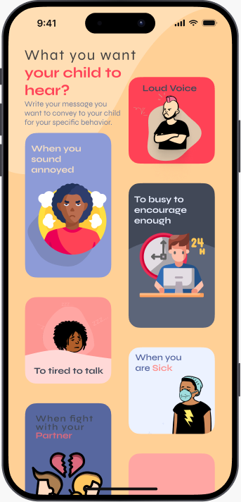
Parents write for the moments they recognise: sounding annoyed, a loud voice, too tired to talk, being sick, after an argument.

Three messages per tone before anything works

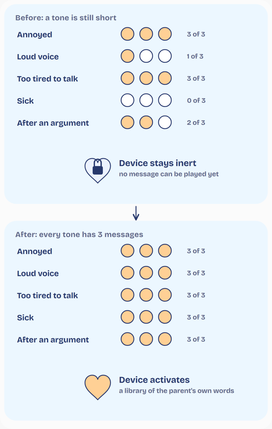
The writing screen tells parents why: children get bored easily. A child who hears the same sentence every evening stops hearing it. The device stays inert, and Home stays locked, until every tone has at least three messages.

Diagram: before, a tone is still short, so the device stays inert (annoyed 3 of 3, loud voice 1 of 3, too tired to talk 3 of 3, sick 0 of 3, after an argument 2 of 3). After, every tone has 3 messages and the device activates with a library of the parent’s own words.
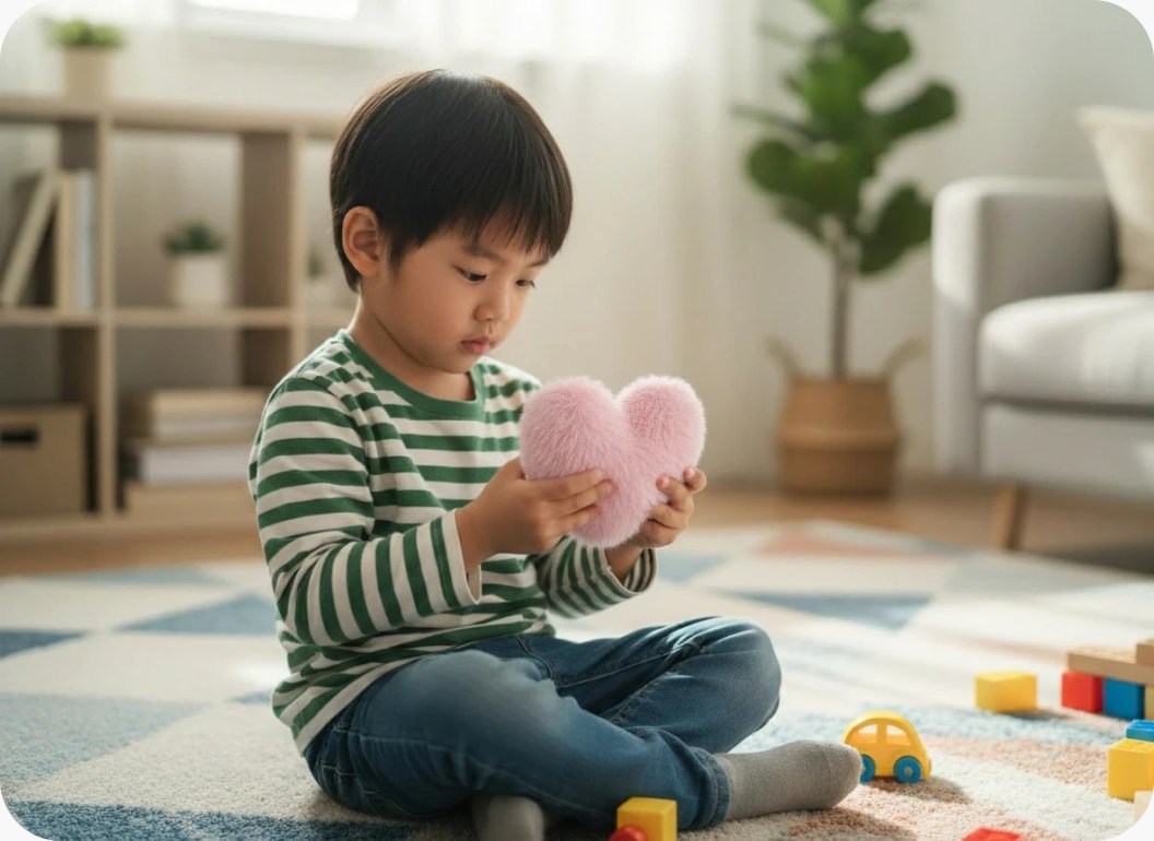
A child holding the fluffy heart toy

Why a fluffy, colourful heart

Heart. This product is more than an exchange of words. Through it, parent and child exchange their hearts. Even when parents are at work, their heart belongs to their children. The toy is that heart, as a symbol a child can hold.

Fluffy. A fluffy texture is comfortable to hold, and it feels warm.

Colourful. Children like colourful things. The toy will not come only in baby pink or navy blue. It will also come in bold primary colours, because those attract children.

An app that asks the parent to look back

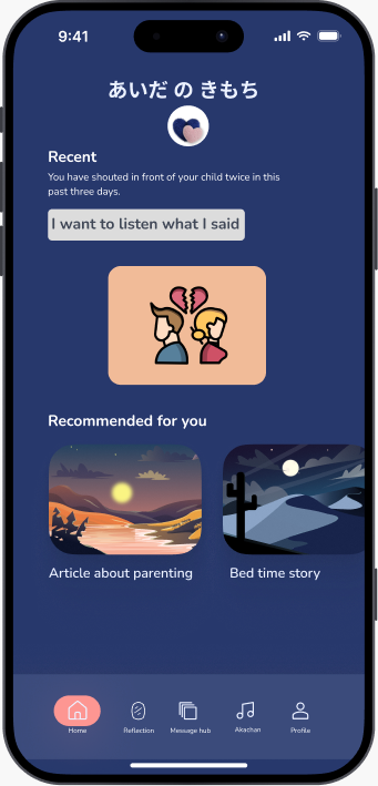
Home tells the parent, plainly, how often their voice was raised in the last few days and offers to play back what the child heard. The message hub groups everything by situation, with a face for each one, so a tired parent finds the right place quickly.

The app looks very different from the toy, and that is deliberate. The toy is for the child. The app is for the parent, and I chose its colours to make it a calm place: the quiet colours you pick when you want to show calmness, nothing loud.

Two phone screens of the parent app: Home, and the message hub grouped by situation

Colour palette

The app is for parents, so its colours are calm. The logo uses baby pink and navy blue, the colours of baby clothes and baby brands, because babies are drawn to them.

Navy#27376BLogo, app backgrounds
Peach#FFCD93Main buttons, highlights
Baby pink#E9B8C4Logo
Powder blue#E9F4FDForms and content areas
Lavender#E9EFFFWordmark on navy
Navy grey#404756Borders and body text
Coral#FF4155Loud or angry tone only

Toy colours

Baby pink
Red
Yellow
Green
Blue

The app, screen by screen

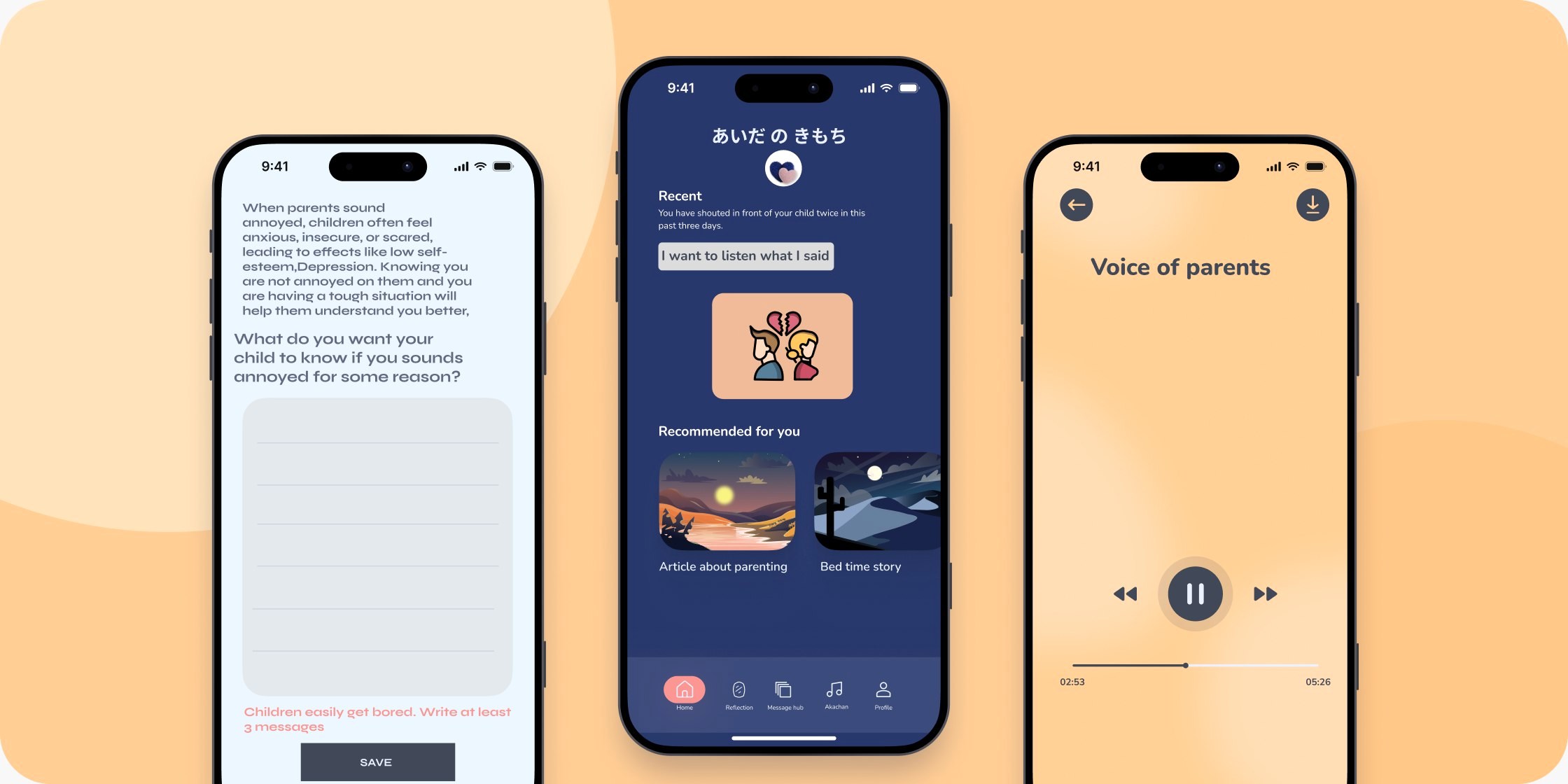
Three phone screens of the parent app on a peach background: write a message, home, and the player
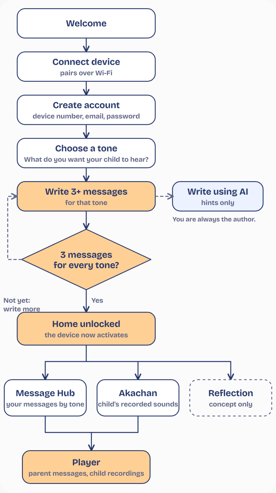
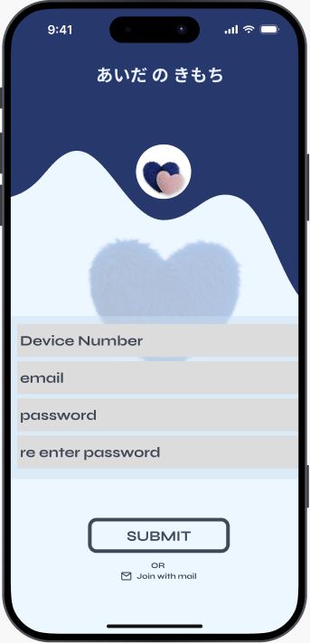
Diagram of the app flow: welcome, connect device over Wi-Fi, create account, choose a tone, write three or more messages (with optional AI hints), then Home unlocks. From Home: message hub, Akachan with the child’s recorded sounds, and Reflection, a concept only. All lead to the player.

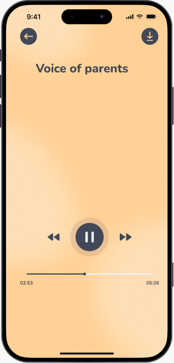
The parent pairs the device, creates an account and writes their messages. Only then does Home unlock. From Home they reach the message hub, Akachan (the child’s recorded sounds) and a shared player.

Reflection, a place to replay harder moments, is a concept only and has not been designed in detail.

Welcome screen

Welcome

Create account screen

Create account

Message hub screen

Message hub

Write a message screen

Write a message

Home screen

Home

Player screen

Player

Learnings and next steps

The decision I value most is a limit. Letting the AI write the messages would have been easier to demonstrate. Keeping the parent as the only author is what keeps the comfort real.

The open questions we listed at the end of the workshop are where I would go next. Should the parent get a special notice when the same message keeps being sent, as a nudge to reflect? How much of the sending should be automatic? How should the exchanges be archived so a child can look back on them when they are older? And how can the child reach out more, so the device never turns into “the child must understand the parent”?

Before any of that, the next step is a working device and time with real families.

Made by Group C at the Sony × University of Tokyo Slow Tech workshop: Guchhait Gargi, 加藤 夢生、白石 希実、山中 登生.